GO, Pathway enrichment bubble plot
Introduction
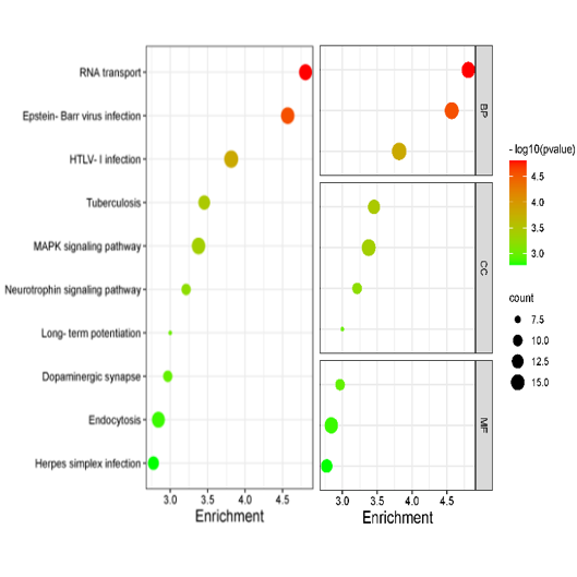
Bubble plot is generally used in GO, KEGG pathway enrichment analysis, in which p values are represented by colors, gene counts are represented by bubble size.
Please use
GO, Pathway Enrichment Analysis or
metascape to get the enrichment results, and then plot. Reference: ggplot2 R package
Input data instructions
Input data contain 4 columns: the first column is GO or KEGG Pathway term (display in Y axis);
the second column is enrichment (display in X, if no, replace by others, such as gene ratio, -log10(p), count;
the third column is p (or FDR), represents colors;
the fourth colunn is gene count (size of bubble).
Optional for fifth columns, plot by class with facet, for example BP, CC, MF.
Paper example
Honghua extract mediated potent inhibition of COVID-19 host cell pathways
Writing tips
Dot plot of the KEGG pathway enrichment analysis. The horizontal axis represents the gene ratio, while the vertical axis represents the enriched pathway name. The color
scale indicates different thresholds of the p-value, and the size of the dot indicates the number of genes corresponding to each pathway.
1) How to plot?
1, Put data in excel according to the example format.
2, Copy and paste into input frame.
3, Input pre-checking button to check input
4, After checking pass, select parameters, submit and download
2) How to cite?
4000+ papers in (Google Scholar)
Tang D, Chen M, Huang X, Zhang G, Zeng L, Zhang G, Wu S, Wang Y. SRplot: A free online platform for data visualization and graphing. PLoS One. 2023 Nov 9;18(11):e0294236. doi: 10.1371/journal.pone.0294236. PMID: 37943830.
3) FAQs